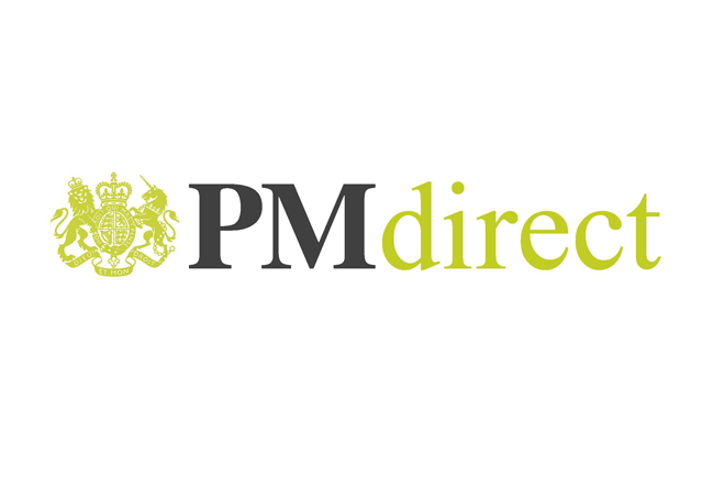
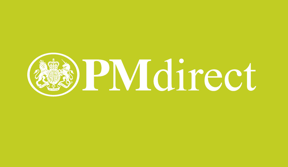
PM Direct
Category
Branding, Public SectorAbout This Project
Before David Cameron became Prime Minister, he use to chair ‘town hall meetings’, where he would stand on a small stage and address an audience of local people, debating issues and promoting his party’s messages.
When he became Prime Minister, it was decided to repeat the same format so that local people could meet him in person when he was available – the idea being that he could be consistent in his connection with
the people.
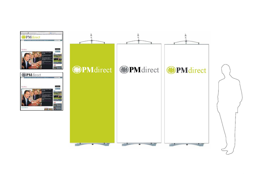
The examples shown are a taster of the initial logo alternatives produced in four hours. By the deadline, banners and other collateral were produced and ready for use. The Prime Minister also uses the brand for face-to-face communications such as
‘PM Direct’ events.
Project
The task was to find a name and create a simple, suitable and relevant brand identity for the newly formed coalition government. At the same time, my team and I were asked to develop the HM Government brand identity. The deadline was 72 hours from being given the brief. This included the creation of the two identities and showing how they might be expressed in different communication formats, for example banners, brochures and websites.
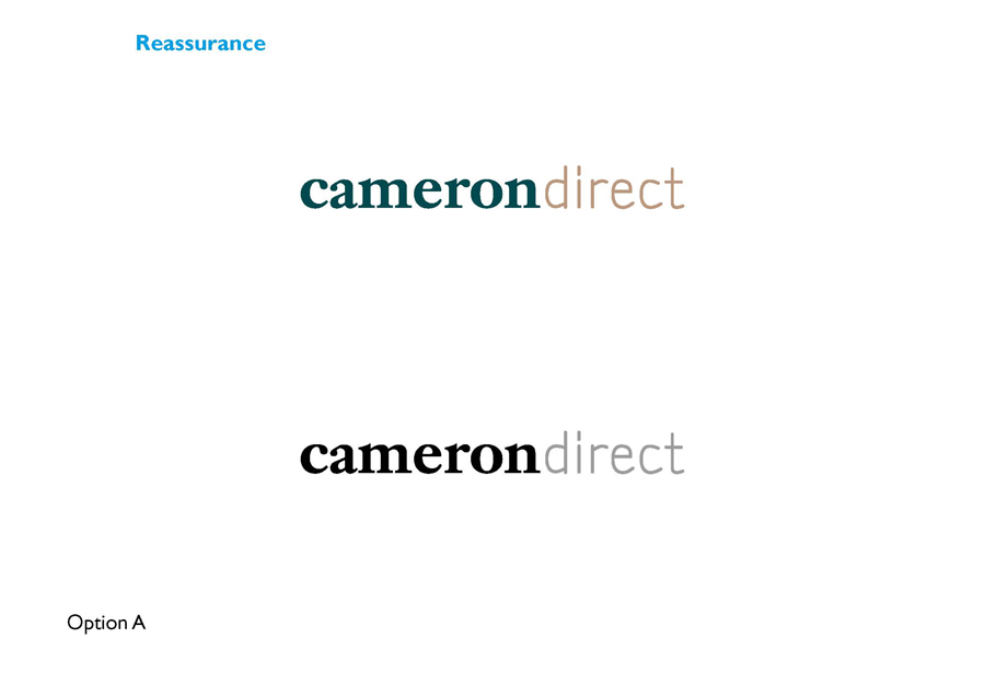
Option A
This option is clean and simple, with emphasis on the word Cameron
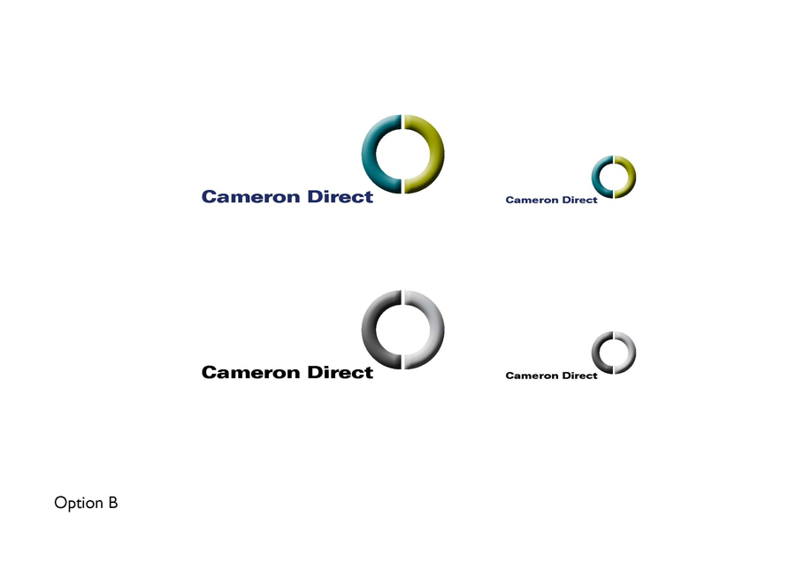
Option B
A development of the original ‘Cameron Direct’ mark. The C and the D of Cameron Direct have been simplified to show unity of two parts but still retain the original focus and the target. The colours have been modified making them less political and modern. The use of upper and lower case in the name makes the mark friendly and approachable.
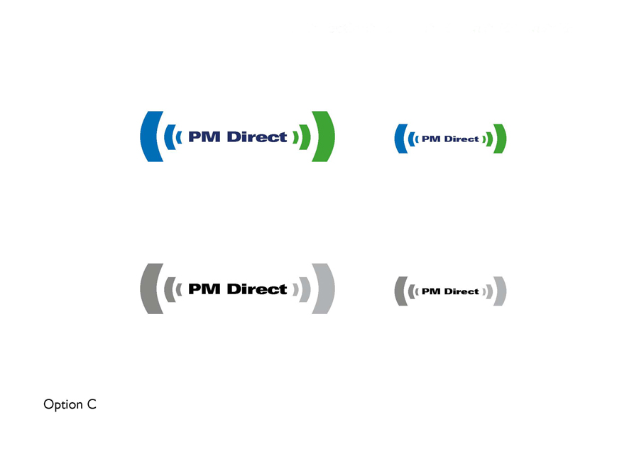
Option C
This option uses a more generic title that can be modified to suite different needs yet still retains the message of reaching out and being proactive by the use of sound waves. The colours of the original mark are retained and the use of upper and lower case lettering give the mark a modern friendly feel.
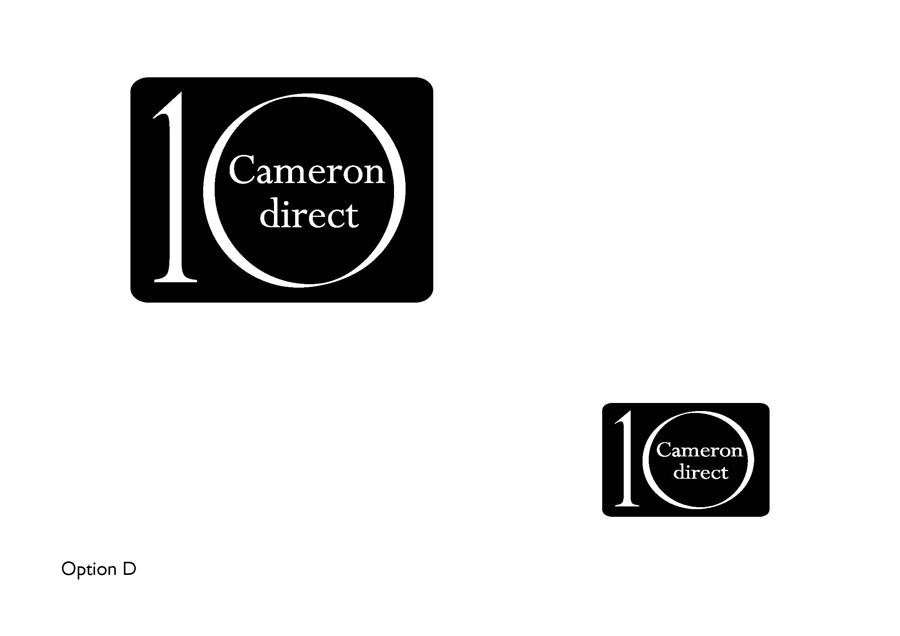
Option D
By putting title within the 10 it becomes instantly recognisable it is from the Prime Minister, giving it gravitas.
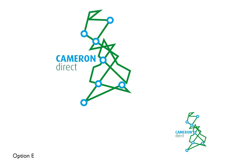
Option E
This concept reflects movement around the UK, connecting with the public. The abstract line, indicative of the journey creates a representation of the country
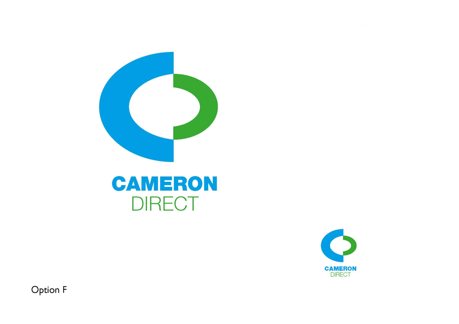
Option F
A development of the campaign target icon which portrays 2-way communication and connections but also has a subtle representation of a capital C and D.
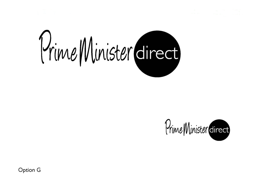
Option G
This idea is based on the idea of the personal touch of a hand writing with Direct within a large reverse out circle meaning to the point.
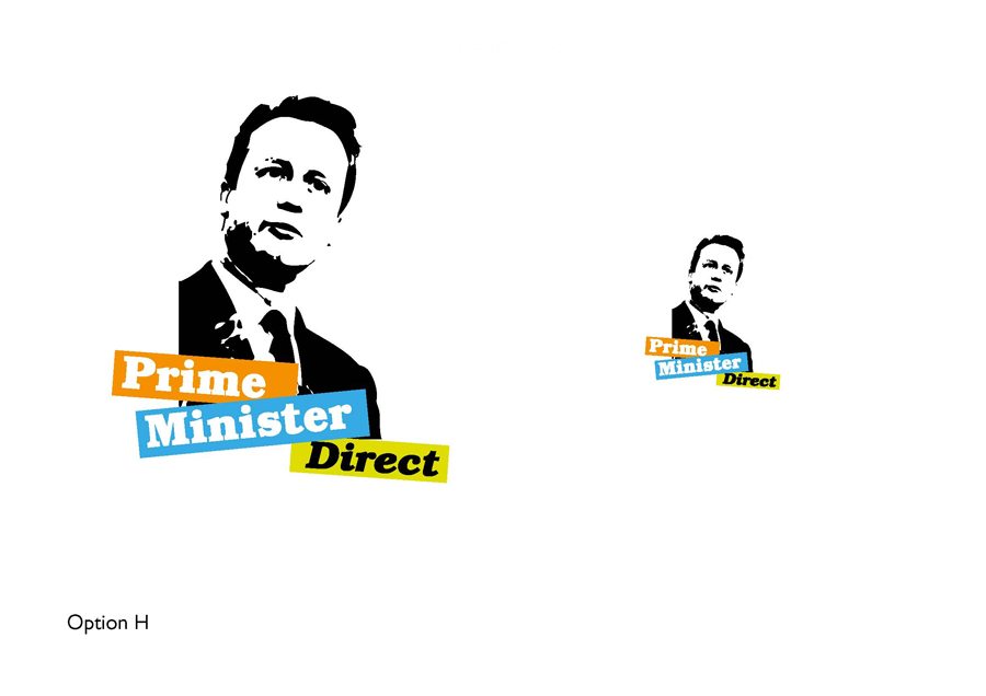
Option H
This concept is formed around the idea of David as a person – live, in the flesh. If you want to meet and talk to him, he’s coming to you.
The text is treated in an energetic style and this combined with the chosen colour palette conveys an energetic pace, suggesting movement and discussion.
Role
Creative Director:
Keith Vernège
Designers:
Chris Davies, Les May, Neil Thompson,
Nicky Humphreys, Vikki Ellis